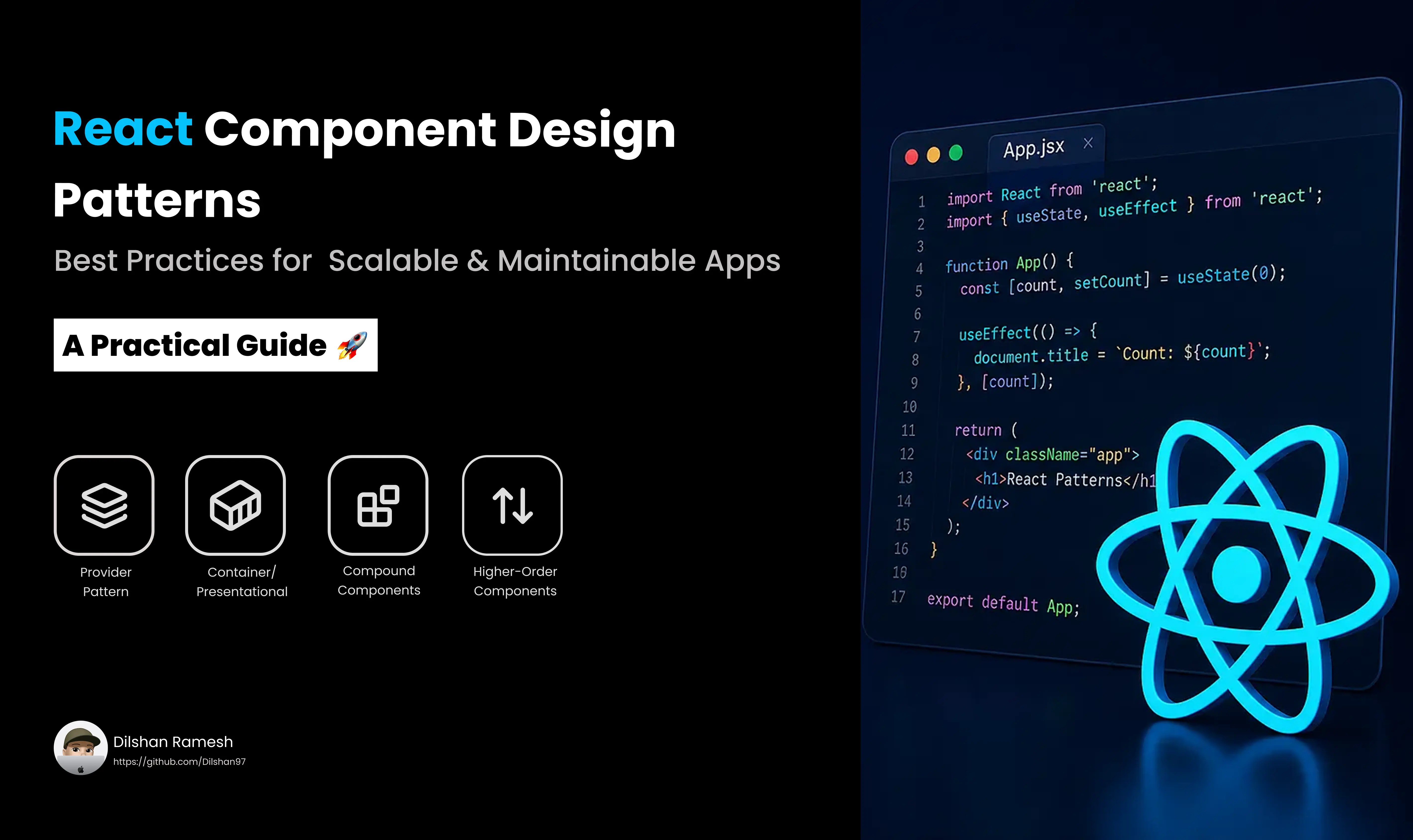
As React applications scale, codebases often face predictable bottlenecks: bloated components, duplicated logic, and brittle prop drilling. Component design patterns offer battle-tested architectural blueprints to solve these exact challenges, keeping your UI code modular, maintainable, and readable.
Whether you are building a design system or structuring a large enterprise dashboard, mastering these core design patterns is key to writing clean React code.
1. Compound Components Pattern
The Problem
When building UI elements like accordions, tabs, dropdowns, or select menus, managing shared internal state across child components usually leads to rigid prop API definitions or messy state lifting.
The Solution
The Compound Components Pattern allows a parent component to implicitly share state and logic with its child components using React Context. This yields a highly flexible, declarative JSX API similar to standard HTML elements like <select> and <option>.
Implementation
import React, { createContext, useContext, useState, ReactNode } from 'react';

// 1. Create Context
interface ToggleContextType {
  on: boolean;
  toggle: () => void;
}

const ToggleContext = createContext<ToggleContextType | undefined>(undefined);

// Helper hook for child safety
function useToggleContext() {
  const context = useContext(ToggleContext);
  if (!context) {
    throw new Error('Toggle compound components must be used within <Toggle />');
  }
  return context;
}

// 2. Parent Component
export function Toggle({ children }: { children: ReactNode }) {
  const [on, setOn] = useState(false);
  const toggle = () => setOn((prev) => !prev);

  return (
    <ToggleContext.Provider value={{ on, toggle }}>
      <div className="toggle-container">{children}</div>
    </ToggleContext.Provider>
  );
}

// 3. Child Components
Toggle.On = function ToggleOn({ children }: { children: ReactNode }) {
  const { on } = useToggleContext();
  return on ? <>{children}</> : null;
};

Toggle.Off = function ToggleOff({ children }: { children: ReactNode }) {
  const { on } = useToggleContext();
  return !on ? <>{children}</> : null;
};

Toggle.Button = function ToggleButton() {
  const { on, toggle } = useToggleContext();
  return (
    <button onClick={toggle} aria-pressed={on}>
      {on ? 'Turn Off' : 'Turn On'}
    </button>
  );
};
Usage
export default function App() {
  return (
    <Toggle>
      <Toggle.On>The switch is currently ON.</Toggle.On>
      <Toggle.Off>The switch is currently OFF.</Toggle.Off>
      <Toggle.Button />
    </Toggle>
  );
}- Best For: Accessible design system primitives (accordions, tabs, dropdowns, modals).
- Key Advantage: Flexible markup structure without prop drilling.
2. Container / Presentational Pattern (Hooks Evolution)
The Problem
Mixing data fetching, state calculations, and DOM rendering in a single component makes testing difficult and prevents UI reusability.
The Solution
Separate your concerns into two distinct layers:
- Presentational (Dumb/UI) Components: Pure functions of props responsible solely for layout and styling.
- Container (Smart/Logic) Layer: Modern React handles this primarily via Custom Hooks, separating business/data logic completely from presentation.
Implementation
The Custom Hook (Container Logic)
// useUsers.ts
import { useState, useEffect } from 'react';

export interface User {
  id: string;
  name: string;
  email: string;
}

export function useUsers() {
  const [users, setUsers] = useState<User[]>([]);
  const [loading, setLoading] = useState(true);
  const [error, setError] = useState<string | null>(null);

  useEffect(() => {
    fetch('https://jsonplaceholder.typicode.com/users')
      .then((res) => res.json())
      .then((data) => {
        setUsers(data);
        setLoading(false);
      })
      .catch(() => {
        setError('Failed to fetch users');
        setLoading(false);
      });
  }, []);

  return { users, loading, error };
}
The Presentational Component
// UserList.tsx
import { User } from './useUsers';

interface UserListProps {
  users: User[];
  loading: boolean;
  error: string | null;
}

export function UserList({ users, loading, error }: UserListProps) {
  if (loading) return <div>Loading users...</div>;
  if (error) return <div className="error">{error}</div>;

  return (
    <ul>
      {users.map((user) => (
        <li key={user.id}>
          <strong>{user.name}</strong> — {user.email}
        </li>
      ))}
    </ul>
  );
}
Connecting Them
export default function UserContainer() {
  const { users, loading, error } = useUsers();
  return <UserList users={users} loading={loading} error={error} />;
}- Best For: Pages or components fetching external data, complex form handling, or API integrations.
- Key Advantage: Easy unit testing for presentation components without mocking APIs or hooks.
3. Provider Pattern (Context Architecture)
The Problem
Passing global or semi-global state (e.g., current theme, user auth session, application settings) through many layers of intermediate components results in tedious prop drilling.
The Solution
The Provider Pattern leverages React’s Context API to hold data at a top level and make it available anywhere in the component subtree via custom hooks.
Implementation
import React, { createContext, useContext, useState, ReactNode } from 'react';

type Theme = 'light' | 'dark';

interface ThemeContextType {
  theme: Theme;
  toggleTheme: () => void;
}

const ThemeContext = createContext<ThemeContextType | undefined>(undefined);

export function ThemeProvider({ children }: { children: ReactNode }) {
  const [theme, setTheme] = useState<Theme>('light');

  const toggleTheme = () => {
    setTheme((prev) => (prev === 'light' ? 'dark' : 'light'));
  };

  return (
    <ThemeContext.Provider value={{ theme, toggleTheme }}>
      <div className={`app-theme-${theme}`}>{children}</div>
    </ThemeContext.Provider>
  );
}

// Custom Hook Consumer
export function useTheme() {
  const context = useContext(ThemeContext);
  if (!context) {
    throw new Error('useTheme must be used within a ThemeProvider');
  }
  return context;
}- Best For: Global UI configuration (themes, localization, user profile context).
- Key Advantage: Eliminates prop drilling while maintaining central state control.
4. Higher-Order Component (HOC) Pattern
The Problem
You need to inject cross-cutting logic (like authentication protection, analytics tracking, or feature flags) across multiple independent components without repeating code.
The Solution
A Higher-Order Component is a pure function that takes a component as an input and returns an enhanced component wrapped with additional behavior.
Implementation
import React, { ComponentType } from 'react';

interface WithAuthProps {
  isAuthenticated: boolean;
}

export function withAuth<P extends object>(
  WrappedComponent: ComponentType<P>
) {
  return function AuthenticatedComponent(props: P & WithAuthProps) {
    const { isAuthenticated, ...restProps } = props;

    if (!isAuthenticated) {
      return <div className="unauthorized">Access Denied: Please log in.</div>;
    }

    return <WrappedComponent {...(restProps as P)} />;
  };
}
Usage
interface DashboardProps {
  userRole: string;
}

function Dashboard({ userRole }: DashboardProps) {
  return <h1>Welcome to the Protected Dashboard ({userRole})</h1>;
}

const ProtectedDashboard = withAuth(Dashboard);

// Example Usage in App
// <ProtectedDashboard isAuthenticated={true} userRole="Admin" />- Best For: Cross-cutting concerns like route guards, analytics logging, or third-party SDK integrations.
- Key Advantage: Keeps components focused on primary responsibilities while centralizing policy logic.
Quick Comparison: Choosing the Right Pattern
| Pattern | Primary Use Case | Key Benefit |
|---|---|---|
| Compound Components | Multi-part UI elements sharing state (Tabs, Accordions) | Flexible component composition |
| Container / Hook | Decoupling state/fetching from rendering logic | Isolation of concerns and high testability |
| Provider Pattern | App-wide or branch-wide state sharing | Eliminates prop drilling completely |
| Higher-Order Component | Enhancing components with cross-cutting logic | Centralized behavioral wrapping |
Summary
No single design pattern fits every scenario. Modern React applications typically combine these approaches: custom hooks handle asynchronous state and business logic, compound components power complex UI primitives, providers hold app-wide configurations, and HOCs wrap cross-cutting boundaries.